Wednesday, 11 January 2017

Summative Statement

With the written element of this module focusing on feminist film theory and how the heroine roles with film are represented, I didn't want to create a body of work just illustrating what I had written within my dissertation. Instead I drew importance upon Althusser's concept of "Ideological State Apparatuses' reinforcing oppression and created a possible solution to the oppression of women.

Schools are one of the 'Ideological State Apparatuses' mentioned in his concept, so the idea behind my project was to create an educational game for children between the ages of 11-16. At this age children can be impressionable, and it is well known that the younger generation are more likely to go against social norm and stand up for what they think is right, for instance Sub Cultures.

The game I chose to re-design was Monopoly, as the origin of the game is important as it adds context to my project. The origin of the game being a prime example of injustice of the woman who originally invented the game.

I have really enjoyed this module, I was able to explore many different creative processes, 3D printing, Woodwork, Illustrator, Book Binding and Photography. I thoroughly enjoyed the whole process of creating a concept, development and production and overall I think this shows within my work, resulting in a fully functional, professional piece of work.
This module has really informed my practice a lot, the writing element and the practical has elevated my practice and I would like to take this work on further in the future, focussing on what my passion is, Education.

Final Outcome

Visual and Conceptual Development

Final Presentation Boards


These Presentation Boards have been designed as if they were going into a competition for example D&AD, with a research/concept page, product page, and distribution page.

With these boards being printed A2 and handed in physically as part of the submission, i had to print these in my print slot, so unfortunately i hadn't taken photos of my product to put on the last slide so i had made a mock up.

if i could i would change the last slide, but overall i think these boards are simplistic, not text heavy and displays the product well.

Final Product


Today i had my print slot, so i could finally print all the elements of my game. Although i have checked numerous times, the double sided prints did not print aligned. I am a bit disappointed by this as ive put a lot of work into each element of the game, although ive been reassured that i would never get perfect alignment with the printers downstairs.

The worst is the packaging, as it is really noticeable, but also because i was limited to the size of an A3 print due toit being the biggest side you can double side print with. I decided to print it A3 anyway as a prototype, but i could no longer make styrofoam tray for inside the box as i would have to re-design the sizes for the compartments and i didnt feel like in the time i have left, this was important to my project as it is partly proposed, and this is more of production than it is concept and illustration. 

Nevertheless, I am happy to see my work printed off, although it doesnt look as professional with the alignment, it still looks pretty good, and i think the game as a whole, without the problems, looks great. Obviously, these problems wouldnt be down to the illustrator if this was done professionally, as the production part would be down to a different person/team, once designs were final.

The Votes which i was able to print on coloured copier paper look great, im really happy with these, although two colours havent been delivered yet. The game Pieces also look very good, although they are abit flimsy, as the slits in the two parts which allow them to stand are a but wide, not giving them great support. This would be something i would bare in mind if i attempted to produce something like this in the future.

But Overall, i am really happy with my product, i think it is a good concept and works well with synthesising with my written element of this module. I was able to go to the Photography department in the college and take some photos of it all together and it looks amazing. It all looks very professional, and one all laid out, it takes shape into a board game that you could possibly see in the shops.

Ive had a lot of positive comments on my project, and i feel like all of the hard work put in has paid off, although there are things that could improve, this is something i will learn from and is all part of production. Ive thoroughly enjoyed learning all of the different processes ive used within the module and i think my passion for education, especially in a fun, functional way, has motivated me and inspired me to push further in this project. 

Deed Cards 2


The one thing that i found difficult with this is I didnt want to use money vocabulary, as this game works in Votes and not Money, so i didnt want to use the original language of Rent, Mortgage, Price etc. So instead i asked for advice within the studio and came up with 'Valued at' etc.

I still dont want the values of each issue and category to represent importance, as no issue is more important than another. I would state this in a rule book given with the game, although with the time i have, i have decided that i wont be able to make a rule book, as part of this project will be proposal.

Deed Cards


Ive finally finished the amounts on the 'deed' cards, i finally found examples online of the correct values so the game would function properly like the original game.

Im happy with how these look as they are simple and i like the design on the back, as it is quite refined and simplistic. Overall, i think these are professional looking and work well with the rest of the product design,

Community Chest Cards

Chance Cards


Although designing the cards a while ago, ive only now finalised the facts to put on them. As this is one of the main educational parts of the game, i wanted to show key points from the history of feminism to show the achievements made so far, but by doing this it also shows how some issues that feminists fight for are really important and sometimes unbelievable e.g. 1993 Rape of a wife is now illegal. This is shocking, not only that it was legal beforehand, but at the date in which it changed.

Instead of the original Banker, being the bad guy within the game, i have changed this to the Patriarchy, which is mentioned a lot within feminist film theory, and within the game stops them from getting votes to tackle their issues. 

I really like this, although it wasnt planned in earlier design, it shows the children playing the game that it is Patriarchy that reinforces oppression and is always the 'person' you would be playing against/fighting against as a feminist.

Packaging Woman


Ive finished the woman for the packaging, this will go on the front of the box. The idea is to keep the packaging similar to the original packaging of Monopoly, very simplistic and recognisable.

After the original simple packaging, they then started to put images of the Monopoly Man on the box. This is what i am proposing to represent within my work.

Packaging Design Complete


Ive finally changed my packaging and i love it! i think the changes advised in the crit has definitely improved it for the better, in this case, less is more! I think the simplicity of the design makes it a lot more contemporary, although resembles the vintage packaging well. Because of this, i think it looks very professional and i think it's great.

Initially, i only put the elements on the bottom of the box, which made the top look bare. I decided to make a play on "Parker Brothers", by changing it to "Franklin Sisters", although this a witty joke, it does complete the design making it look like a product instead of just a design.

Crit Feedback

Today we had the final crit before the deadline, i found it really enjoyable to look at everyone's work in the class, everyone has produced really professional work, pushing them so much further.

I was really thankful for the feedback given for my work. I dont have a print slot until the day before the deadline so all i had to show was my board game and the 3D printed 'R's and the presentation boards.

The presentation boards i admit, are not very good. I had done them after i put my board together, just as a tool of explanation for the person(s) giving me feedback. For my presentation boards that i will submit, i am planning on doing 3 that will almost represent competition submission boards.

The feedback given at first was basically on the presentation boards as i had not mentioned that they were not my final ones. Then when explained i got more feedback on the actual work i had made. The best advice i got was about my packaging, as id asked for specific feedback on this on my boards. They mentioned that they also preferred the plain packaging, but mentioned how i could put elements of the game i.e. twitter birds on the packaging like the example Monopoly packaging i had put on the 1st board.

I think this is a great idea and has really helped me with a dilemma i was dealing with.

Printing My Board Game


Ive finally printed my board game today, i was really nervous waiting for it to be printed, hoping everything would come out right. I am really pleased with it, this time 2 months ago, id never used Illustrator before, and now i feel really confident in using the software and i think it shows in this work. 

Ive really enjoyed making this game, it has been fun to see it all come together from initial ideas, developing the design and then finally making it. To see it come out looking as it does is amazing, although the design is not difficult, im happy with how clean it looks, it is probably my most professional looking work to date.

I spent the rest of the day backing it on to grey board and lining with buckram, this was not as easy as i remembered in the book binding workshop, but it was nice to do something off-screen. 

Although i am very happy with this piece of work so far, through a production fault of mine, the board does not bend like other games. I didnt leave enough of a hinge in between the grey board segments, so when bent, the image buckles. As this is a production problem, and would not be my job as an illustrator, I have decided that for now, it looks fine flat, and although i would have liked it to function properly, this works well as a prototype and i am very happy with it, considering the time ive had to produce it.

3D Printed 'R's


My 3D printed 'R's have finally been printed and posted to me. I did order them in purple, although they had ran out so I decided to go with green instead. I actually think this is better than purple, as i have used this quite a lot within the game so the green would be nice to break it up.

I originally wanted purple as it is the only colour which is not one of the categories on the board so i decided to use it for the main colour for the packaging and the name on the board. 

Although i like the 'R's, if i had to do it again, i would consider making them slightly larger and less fragile. They are a good prototype, to show my ideas but in comparison to the board, it is quite small and there is a worry that they could be lost etc.

This would be easier if i could have met with the 3D designer (my brother) in person, as my ideas of size etc. would be easier to explain and show in person. But overall, i am really happy with these, it has been great working with different techniques and out-sourcing 3D printers etc. I think this made me see a bit of what it would be like to create a product like this professionally and what the costings would be.

I only ordered 6, although they sent an extra one, the price of the print was only about £3.50, thats with student discount, excluding delivery. Although this is a good price, if i had printed the full amount needed for the game to function, this could be quite expensive but it is something you would have to budget and shop around for when producing something like this.

Presentation Boards


Packaging Design


Ive started to produce my artwork for the packaging, i want to keep it similar to the original Monopoly packaging as the origin of the game is important to the context of my project.

Using the colours of the suffragettes, i played around with the composition, doing multiple tests. I didnt want the packaging to look like a flag, which i thought both of the colours as stripes, resembled. 

This design is what i have decided to take forward, i think it is a lot more professional. I will have the bottom half of the box green to even out the colours.

Ive added the artwork on to the design, as Monopoly started to add the image of the monopoly man. Although i like the artwork, i am not sure whether i like this design on the packaging. I don't feel like this is professional looking, but as the crit is coming up at the end of the week, i will ask for feedback on this.


Saturday, 17 December 2016

Game Pieces Ready To Print


Once coloured, i put each design back into Illustrator, i did this as Illustrator is very precise, using measurements. So i was able to make each design the same width and create the stands which will hold them up when being played with. Im excited to see whether these will work once printed and put together.

Game Pieces Coloured


I put the designs into PhotoShop to finish off with just simply filling in the shapes with block colour. I quite like how they are really simplistic and similar in design. I think i would like to see what they would be like with different shades of colour in, but with the designs going to be so small, the detail would be lost and it would get too complex in relation to the original artwork used by monopoly. Overall, im really happy with them.

Game Pieces Outlined


Ive finally made the finished outlined game pieces, ready to be coloured in Photoshop. I added different weights of lines to add a bit of depth as the artwork will be block colours, like the original monopoly artwork. I have already put these in Illustrator and Image Traced them so they aren't pixelated. Im quite happy with these so far, i think the line work definitely adds more to the designs.

Thursday, 15 December 2016

Votes (Money)


Ive not applied the different amounts of votes to the design so it is ready for print. Im really happy with the designs, especially since the word 'Vote(s)' is on their, obviously with the rules and aim explained in the rule book, this will be even more clear.

Votes


I have added 'Vote' onto the image and i think it looks a lot better and will be a lot clearer to the players that it is not currency. Also the V will help them understand the votes on the board as they are wrote like V60

Votes (Money)


Ive started to design the votes that will be used instead of currency. I used influence from the original money in monopoly, changing elements like the train and house that are normally in adjacent squares. I was going to change the house into an R, which represents the rights you can buy on each square, like the houses, but i wanted the V to represent Votes, instead of money. I dont know whether i should put 'Vote', under the 1 to make this clear to the children playing, as they will be used to the normal game.

I am also going to print each value on different coloured copier paper to distinguish between the different amounts of votes that each amount represents, like the original. I am using copier paper to give it the same aesthetic as the original game as it is only printed one-sided and on thin paper.

I have to source this paper as it normally comes in big amounts which is not needed for this project.

I decided not to make a detailed pattern on the background of the Vote, as i feel like the original design represents the pattern on actual money, and i dont want mine to resemble currency at all.

I think the design is simplistic, recognisable and will look even better when printed on different stock.

Category Cards


I have now designed the 'Deed' Cards, which are ready to be completed with the different values of votes which the players will have to give a player that has tackled an issue of leading an internet campaign, these values will increase depending on if the player has 'Rights' in the different countries or if they have multiple internet campaigns.


I kept the design of the cards on the back quite simple, i didnt want anything too fussy and i like the simplicity of just having the name and the coloured borders and lines.

Community Chest Cards


I have finished the community chest card designs now, using the chest illustration on the board, the design is simple like the original game and i just now have to put the facts on.

Wednesday, 14 December 2016

Chance Cards


I have designed the Chance Cards in Illustrator, i have used the same question mark symbol as on the board and kept the colour green. To print double sided, i have made this on two artboards on Illustrator and made sure they match so they print aligned, i just have to finalise what i will put on each card.

Packaging Nets


I have started making the nets for the packaging, after the workshop i found this pretty straight forward, the only thing is that i have forgotten how to add in my art work. With this being the net for the bottom part of the packaging, this isn't a big problem, so i am going to draw out the nets anyway, make the artwork to add on and when i come back to college at the beginning of the new year i will go to IT for support to ask how i do this.

I am not worrying about timing as i know this is a really easy part of it and only takes seconds, so as long as i have all the measurements right and the net is correct then this will be a two second job.

There has been a slight adjustment to the size of the packaging, as the styrofoam sheets which i ordered are a little bit bigger and i don't have the right tools to trim this down so it looks professional.
This is not a major setback or difference to the design, just the overall size wont be as rectangular.

3D 'R's


This is the final 3D design for the R's, these will be used instead of the houses and hotels. The players will purchase these 'Rights', with votes for each country. 

I am going to 3D print these, but with the costs of 3D printing, i am only going to print 6 as examples of what they will look like. I did originally want to print enough that the game was playable, but with their being 66 available R's on the board game, this would be a lot of money.

I am sourcing a 3D printing company at the moment, and have found one that will print them at £3.09 each and i can print them in a purple, biodegradable plastic, so it will be environmentally friendly.

Board Game - Board Completion


With all the elements on the board now, the board is now complete. I am really happy with this, it looks exactly how i imagined and even with the changed elements of the original game, it still represents monopoly well. 

FEMONOPOLY


For the name of the game, i had to download a specific font - Kabel heavy. Ive changed the original red colour to purple, and given it highlights and shadow as the original did. The woman character which replaces the original man works well with the design. I am quite happy with this so far.

Community Chest

Designing the community chest, i decided to keep it similar to the original as that is what i did with the chance cards. So i drew a freehand chest on illustrator, although i didnt make any development before this, i knew it would just be a simple treasure chest illustration.

I decided this to be shades of purple, the original is shades of blue but with the community chest and chance cards together, they will make the suffragist colours of green and purple collectively.


I am really happy with this, i am not as confident as most with Photoshop and Illustrator, so i think it could be improved with more skill, but overall, i think it represents the function of this square well, its simplistic which fits with the rest of the game and the colours go in the colour scheme.

Monopoly Woman


I chose this drawing to develop further as the replacement for the monopoly man, she is a suffragist so has the same traditional character as the monopoly man. Although not exactly the same style, she is as simplistic and i like her character, i used contextual references to the original character when i was creating her in illustrator and photoshop. 

Ive used similar colours, with the added hint of purple and green and used similar use of shading on the hat and use of white to add creases in the clothes under the arms.

I really like this design, i think she fits in well with the theme of the game and still resembles the original game well.

I made a consious decision not to add a lot of shading etc. as the original design of the monopoly man, once colour was added, was only block colours, and the origin of the monopoly game is what is important to add context and synthesis to importance of this particular game.

Board Game Elements


These are the finished elements, done in illustrator and coloured in photoshop. I am quite happy with how simple they are, they will look good on the board.

Chance

During making the board for the game, i came into a problem regarding the chance square. All of the squares on the board game have a symbol or one illustration representing it, although my design for the chance card was more of a pattern, as i didn't want to use one gender symbol.

Because of this i have reverted to the original symbol used in the original monopoly game, a question mark. I came to this conclusion as the symbol does represent the cards well and I didnt want to have a pattern in the square.

I have changed the font of the question mark and the colour to keep in with the green and purple theme.


I think this is a good change, although i cannot use the previous design, it definitely works better than it would have done. Sometimes less is more and i think this is a cleaner design and will work well on the board and on the cards.

Initial Designs for Board Squares


I have done some initial drawings for the squares replacing the tax etc. plus the drawings for the corner squares on the board.

The illustrations replacing the tax squares etc. are going t be simple, like the original ones, i like when it is one simple image, so i am toying with the product one as i have designed it with two products.

I have kept the policeman in the similar style but changed him so its more of my design but i wanted it to be recognisable.

Ive also changed the man in jail to a woman, keeping it simple again so that it reflects the original, i now have to put these into illustrator and design them fully before placing them on the board.

Electric Company, Water Works, Income Tax, Super Tax

One thing that i have only thought about was what i could replace the Electric Company, Water Works, Income Tax and Super Tax with on the board.

These elements on the original board are squares in which the players have to pay money back to the banker, so these also have to have the same function on my version of the game, but all of these are related to buying property etc. and the bills that come with it, so these have no context within my game.

So the first thought was that i could have a look at what things women pay more for as women, for example Pink Tax.


So i did some research and these were the things that i found:

- Health Insurance - Women pay more for Health Insurance as they live longer than men, visit the doctor more and give birth. Although research has found that men create more cost in surgeries etc.

- Mortgages - Women pay more in Mortgages, which maybe due to earning less than men but nonetheless, they still have to pay more in total.

- Dry Cleaning - Although clothes are the same, women have to pay more for the same service

- Clothes - A study found that a plain, rolled up sleeve t-shirt for women in Topshop is £12, but for the same style T-Shirt, which could be argued that has more fabric use for the bigger size is £8 in Topman.

- Products - PinkTax - Women pay considerably more for products that are the same as men's for example, razors etc. just for them being a female product.


Although Dry Cleaning was mentioned in a few articles, i thought that this is not as widely used by males and females as the others. So i will use the other 4 examples to replace the original Squares on the board.

The only issue with this is that in the original game, they player hands over money instead of Votes, which is what i am using instead of currency. With these issues i am using are primarily consumerism issues, involving money, i have to think of a way this can still work on the game.

As the players will be playing as one of the women in the game, earning votes to tackle each individual feminist issue, i will mention in the rules that Women do pay more for these things in life, meaning that when society places these extra costs on to women, achieving their goals (votes for tackling the issues) can be set back. These set backs can cost them progression in their cause, meaning they have to give up so many Votes when landing on these squares.

Board Game - Board


Ive started to create the board for the game on Illustrator. Creating simple shapes, i was easily able to create the main design of the game quite quickly.

I filled the small rectangles with the different colours and started to create the different categories and issues on the board. In the last peer review i had discussed how i should make the categories clearly defined on the game and it was decided that putting the different issues in the coloured rectangles would be best. Once completed, i think this looks really good, i have used the type used by the original monopoly game.

Now all the different categories are done and the design is complete, i just need to add in artwork for the different elements e.g. GO, Jail, 'free parking' - which is going to be 'peaceful protest', GO TO JAIL, Health Insurance, Mortgage, Products and Clothes.

I also have to add the name of the game and an illustration of my version of the monopoly an which is a woman.

Tuesday, 6 December 2016

Game Pieces


I have created some initial designs from the designs i did from the task, but i have changed some of the women and added more so i have 8 game pieces instead of 6 as there are 8 in the game.


Each of the women fight for a different cause, so the players will each be playing for votes for each of the causes, making a level of competitiveness between the players.

I want to make the characters a bit more uniform, e.g. the same spacing for nose and eyes etc. so im going to make a template and use the light box to re-draw them all.

Saturday, 3 December 2016

3D Tray for Packaging

After the Illustrator workshop, i went to the IT department and spoke to the technitian who gave the workshop, about the problems with the tray in woodwork. He said he could help me create a 3D model of it, which i could potentially get 3D printed.

We went to a suite where they had the right software and we started designing the tray. The actual design was quickly produced and he went through it step by step with me. Because the plan was to be 3D printed, the angles on each compartment were no longer necessary. 

As we went on creating the design, it was noticeable that it was no longer going to work. The compartments for the money would no longer work as the players wouldnt be able to get the money out. 

We spoke about it and came up with the fact that this probably wont work, and i would end up spending too much time, on what i consider the presentation, as i could propose this and just make something temporary for the hand-in.

He mentioned how there used to be an interior design course where they would make mock-up rooms with cardboard. But then he also mentioned how I could use styrofoam sheets and carve out the tray, as it is used for prototypes and is a material where you can sand it down etc.

I think this is a really good idea, i can make the tray out of styrofoam and just propose the plastic tray, as it would be mass produced. Although, i am quite upset that i couldnt make it how i wanted, in the time i have left, i need to consider proposing this as i have now tried multiple ways of doing it and the styrofoam will be just as good as prototype.


After this has been cut to the design i want it, i can then spray paint it black before it goes in the box. I will have to make sure this doesnt rub off before i put the art work in there, so a test piece will have to be done first.

Illustrator Workshop

Today we had an illustrator workshop where we learned how to make nets for packaging. We learned how to make fold marks, either on the net or outside the net design so it wouldn't be visible. We also learnt how to add illustrations or artwork and make it so that it lines up so it can be printed double sided, with the net on the back and the image on the front.


I thought this workshop was really useful, i don't really use illustrator, so it was good to get some of the basics down. I also asked for a bit of advice for my game and creating vector images.

He showed me a few ways of how i can do and the one that i think i will be able to do well, with time i have to practice, is image trace.

Drawing out the illustrations by hand and then image tracing in illustrator to create vector images, will be a really good idea, although he did mention that it is hard to change the colours once youve done this.

Another way would be for me to draw the outline of the images, image trace and then fill will different colours in illustrator.

I think i will do both of these, in a sense, i will draw out the illustrations, make a copy, then i will do the outline and fill colour in illustrator, if this doesn't work, i will colour the illustrations in using copic markers (something where the ink is fluid and creates solid colour) and then image trace the finished thing to make it a vector and then i can apply it to the board or packaging etc.


Woodwork

In the meeting when i took the drawings down to woodwork, the guy who was working said that it would be pretty difficult to make, but leave it with him and check up on him.

Today i went down and unforetunately hes not sure he will be able to make it, the problem is is that with it being so intricate, it could take him up too a week to do, meaning he wouldnt have time for teaching. He mentioned an alternative and said that maybe take the design to IT and see if anyone knew CADCAM software, to make a 3D design and out source it to a woodwork company as they would have the machinery to cut it out of one piece of wood in a machine.

I was a little disheartened by this, only because i was really excited to make this element of the game, as another thing i could cross off my list. But i have time to find alternative ways of making it and i still have to go back to see him on monday to see if he definitely cant make it.

3D modelling for House and Hotel Replacement

My brother fortunately studied Game Design at University and after doing his masters now works for a game company, so he is very capable creating 3D models. I have asked him if he could create a 3D letter R design for me to send to 3D printers. 

For him, this is a pretty easy task and ive asked him to just try things out and send me screenshots.

He did a few straight away and sent them over to me.....


I liked this because of the symbolic reference, but as the 'R's are going to be so small, this could be quite small to notice.


This also looks good, but my comments were that the thickness of each R needs to be 1cm, as they need to be sturdy when stood up.


I sent this quick, basic sketch just to show the dimensions, but not that as i already specified measurements, but to show how it needs to be chunky and sturdy like the original plastic houses and hotels.

I am now waiting for more designs .

Wooden Mould Design - Vacuum Forming

During breaks between the peer review on monday, i had been going down to the woodwork department to make an appointment to make the wooden mould which i will use to vacuum form my plastic tray to sit inside the box.
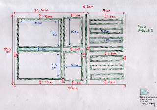
I have to go in on thursday, which means i have to draw up the design for the tray, i have to keep in consideration that angles will have to be added to each compartment as for the plastic to be removed from the mould, it needs an angle or the plastic will stick and the mould will not come away.

I had to make concrete decisions on how big each compartment was going to be. Using a tray from the original monopoly board game as a template, i used the overall dimensions, but changed the compartments to make it simplified and suited to what i would like.


This was my first attempt, it took quite some time to get all of the measurements to add up and make the design. The only thing i hadnt done was drawn the angles as i thought they could just be added on by the people in woodwork, but then i realised that this would change a lot of the dimensions.


This is the final design, i wanted to add as much detail as possible so it would be easier for the woodwork technition to understand the design.


I also did a design from a side angle, to show the depth of the pockets and how the tray will dip at a point so the board game, when folded can sit in comfortably.